Graphic Design
-

Complex Spunge
One day on Instagram I saw footwear designer Salehe Bembury ask someone to illustrate a poster for him for ComplexCon. So I intuitively decided to take a shot at this project. I started with a blank sketch of a photo of him sitting at a desk and moved it to a digital rendering.
With the digital rendering, I wanted to make it seem like he was sitting at his booth presenting his product(s) or almost like it was "The Salehe Bembury Show." It ended up being a very interesting composition. I wanted to include every single detail that I could ooze out of this. I included the ComplexCon logo and went into intricate detail with him as well. The swirling lines in the background were inspired by his signature fingerprint that you see in a lot of his designs, which represents his brand identity. One of my favorite pieces of this was the illustration of his shoe the Pollex Croc, "Kuwata," which was one of the hottest shoes of 2022.
I thought this brightened up the color composition even more and gave the detail even more of a highlight. I also love how it looks as if he is highly admiring his work above him.
I had a blast creating this! And thought even more about the option of graphic design advertisement as a result of how much fun this was to create.
-
Retro Ye
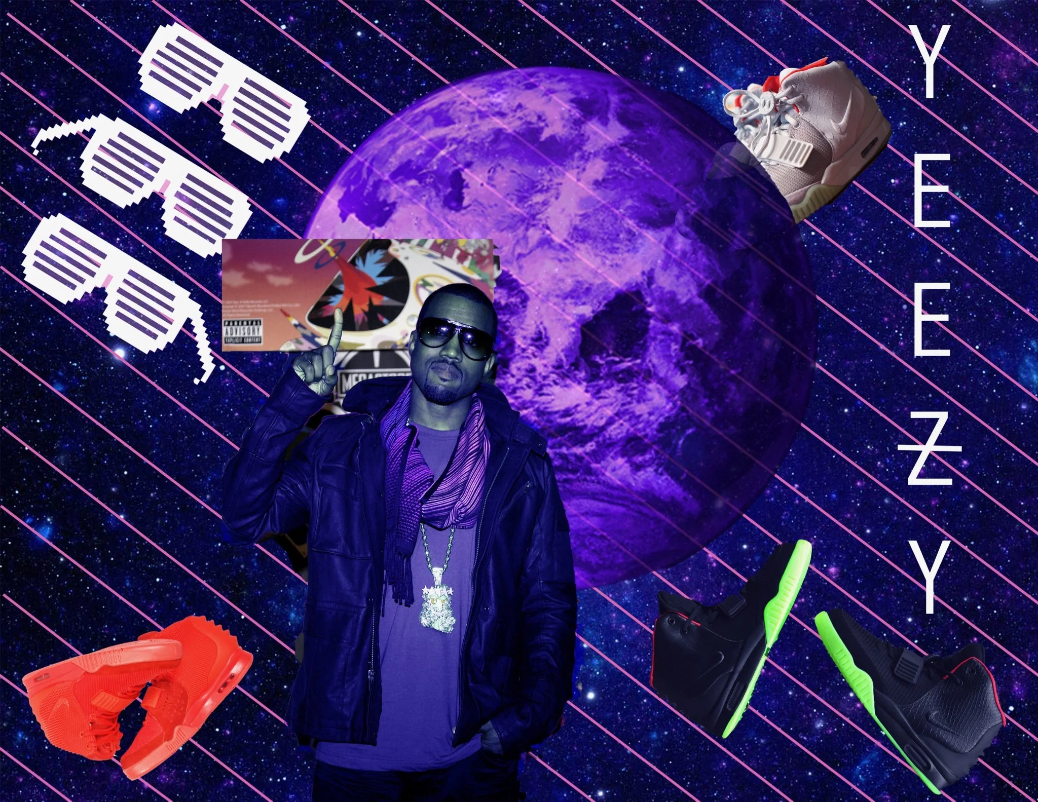
This started as a photoshop class project that I decided to take further after graduation. We were instructed to use the program to create a poster or ad for a person of our choice. In choosing Kanye West, I first put together a collage of images that commerorated his entire career.
After thinking on this project for some years, I figured, why not revamp this thing and make it more specific? I asked myself, "What do I love about Kanye?" And then it hit me. I will never forget the era when he dropped my favorite album of his, Graduation. What a time. He also had arguably the best sneaker out at the time. So, hottest music? Hottest Nikes? I not only wanted to celebrate these things but also take it back to when I really began to connect heavily with that he was delivering. Props to the guy, Retro Ye.
-
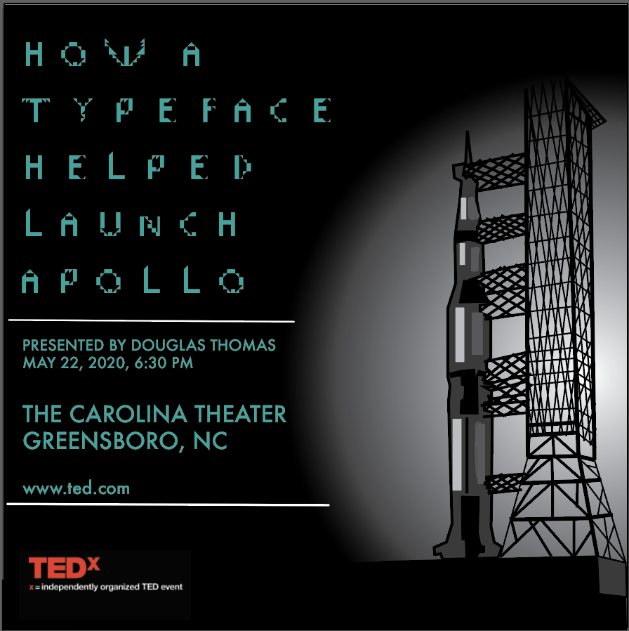
How Futura Helped Launch Apollo
Poster design for a TEDx talk (typography project). Futura, the lower typeface, was used to help astronauts read buttons, switches, etc. in the Apollo 11 space shuttle en route to the moon. Upper typeface and space shuttle illustration designed by me.
We were also asked to create a social media series of designs based on this concept, for Facebook and Instagram. This was my Instagram post for the series and the sketches that led to it.
I wanted to draw a lot of attention to the space shuttle and its detail of course. But also with the type, I wanted to give a neon/blacklight feel with the teal. I also thought this worked well with the red as both colors stood out in the dark very nicely and gave it a very "blacklight" NASA theme.
